Jakdojade

UX flow optimization, not UI redesign       ૮ ⚆ﻌ⚆ა
Project Overview
Jakdojade is a Polish public transport app for planning routes and buying tickets.

‍This app already has a clean and modern UI. My goal was to keep the visuals, but improve the flow: fewer steps, faster validation, less stress at turnstiles.
Problem
1. Too many steps at validation → stress in queues.
2. Tickets shown separately, not grouped → confusing with multiples.
3. Buying many tickets = repetitive +1 taps → inefficient.
Research & Feedback
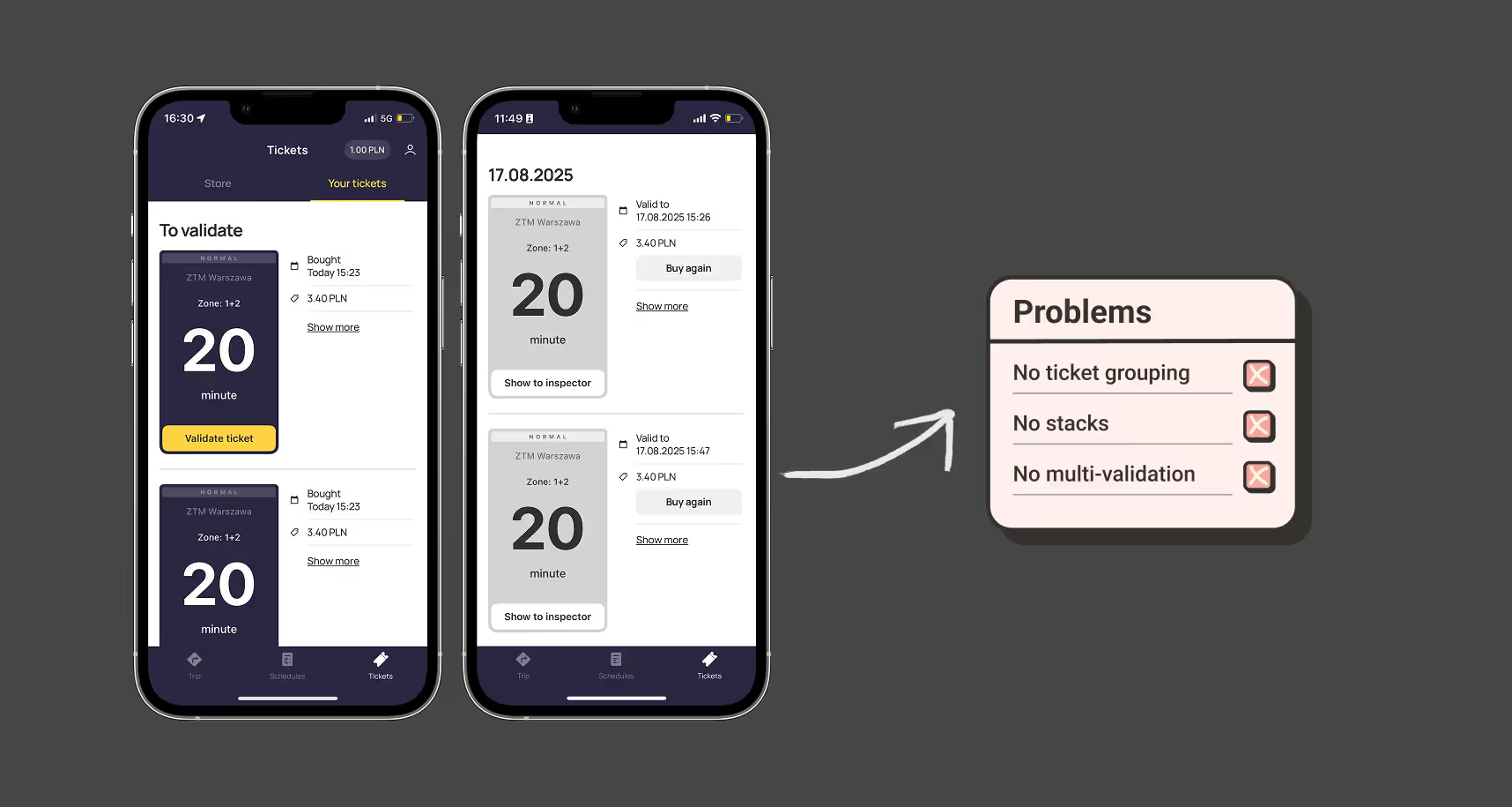
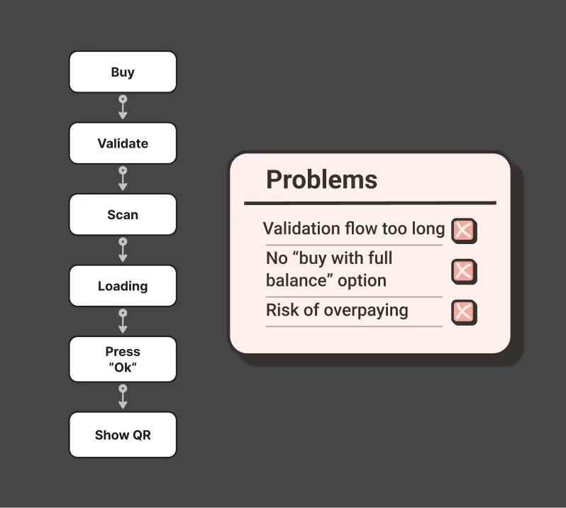
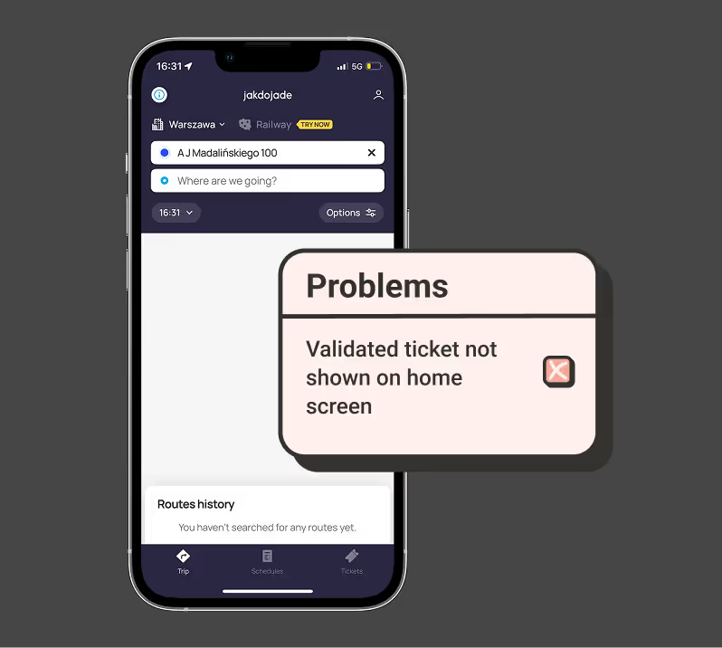
As someone who uses the metro in Warsaw almost every day, I find the current validation flow frustrating. It takes too many steps and often creates stress, especially at turnstiles or when inspectors appear. After paying, the main reason to open the app is simply to show the QR, so it should be the very first thing users see.

I also researched user reviews in the App Store, Google Play, and on Reddit. Many people expressed the same frustration: the delay between buying a ticket and being able to validate it is too long, which makes the whole process feel stressful and unreliable.
Before
- Section Tickets is split into “To Validate” and “History”, but both are just long lists.
- Every ticket is shown separately, even if several identical ones were bought at once.
- No way to validate multiple tickets together
- In History, even repeated purchases (e.g. 3× 90-min tickets) appear as three separate items.
After
Grouped tickets into stacks (e.g. “20-min × 3”, “90-min × 2”).
✅ From a stack → option to validate 1, or validate multiple at once.
✅ In History, repeated purchases are also collapsed into stacks (e.g. “3× 90-min”).
✅ Each stack has a “Buy Again” button → instantly repurchase your usual set without re-selecting duration/zones.
✅ Effectively creates personalized presets
Before
- Home screen = empty space, no active ticket shown.
- No quick info about how much time is left — only visible deep inside ticket details.
After
QR code is instantly visible on the home screen after validation.
✅ No need to dive into menus — one glance = ready to show inspector.
Here’s an alternative with a fancier look, but the same usability
Check time or show QR right from the widget