AT Bank

Role: Product designer ૮ ⚆ﻌ⚆ა
Project Overview
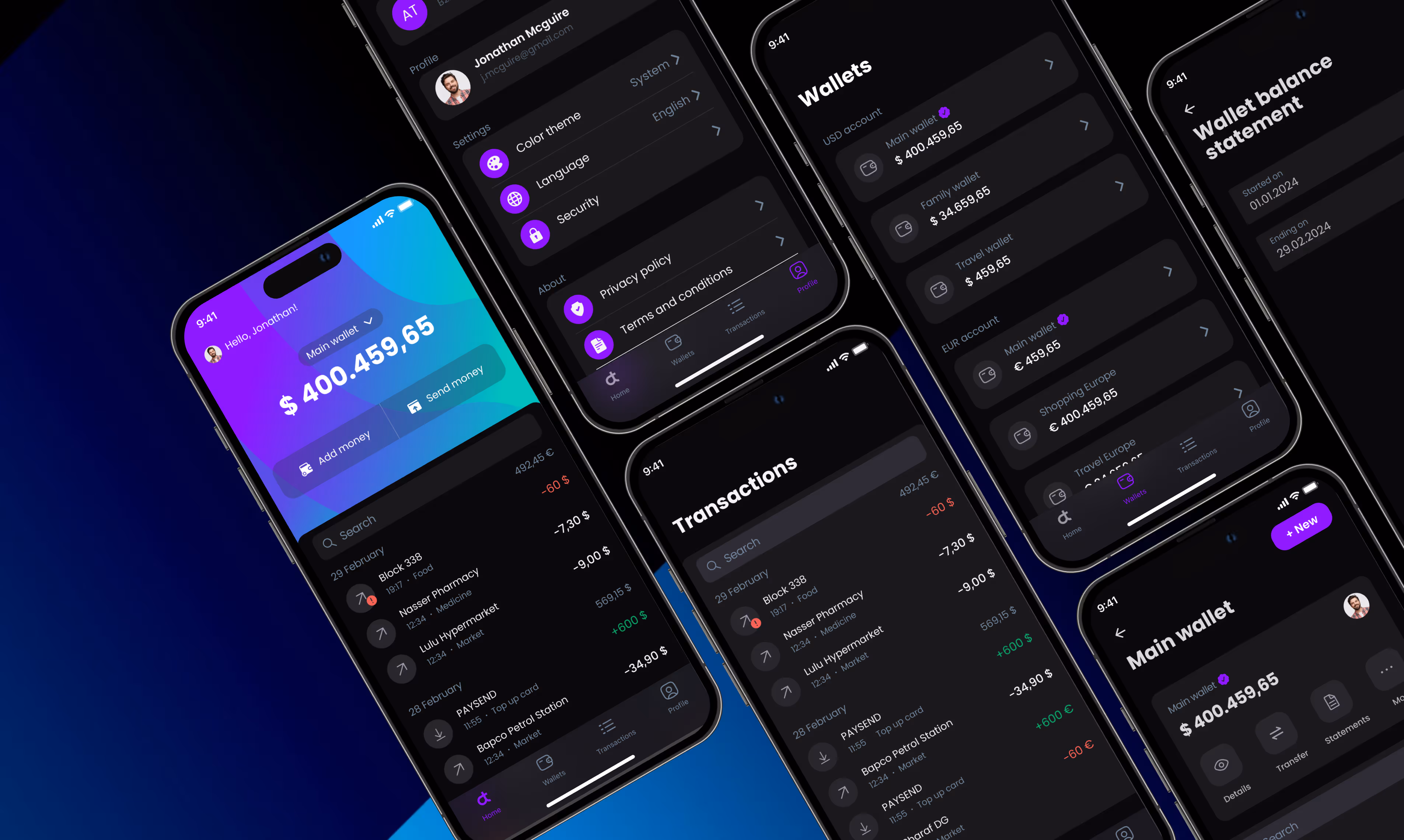
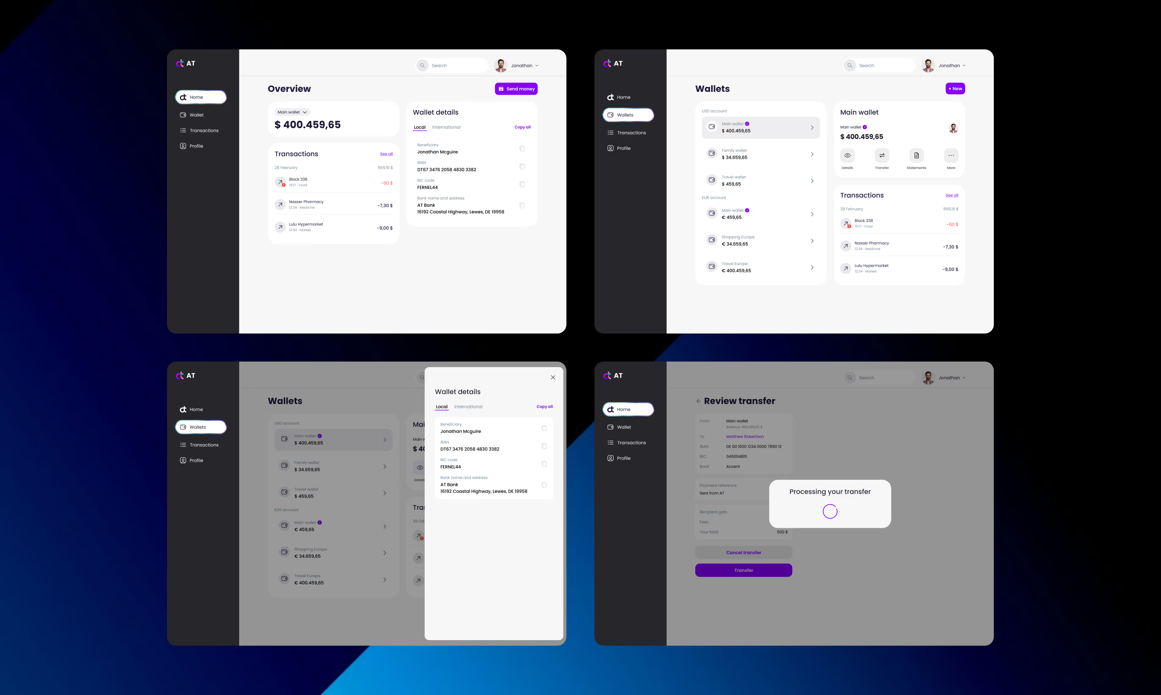
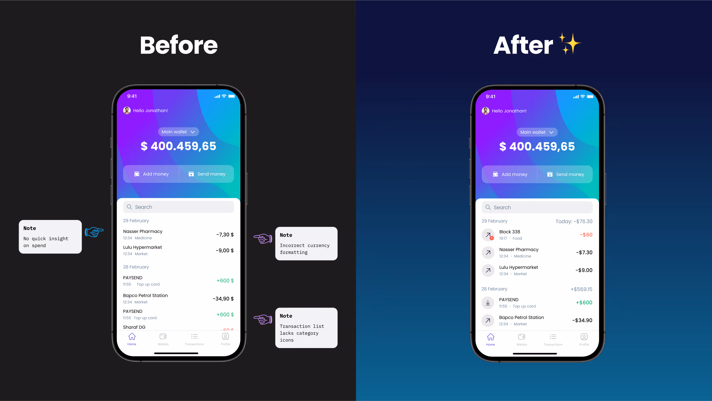
AT Bank is a mobile and desktop product for managing multi-currency wallets. It lets users switch accounts, make fast transfers, track analytics, and review expenses — all within a unified, responsive design system that supports both light and dark themes.
My Contributions
UX Research, End-to-end UI/UX design, Cross-platform adaptation, Analytics, Atomic design system.
tools
Figma, Notion, Google Analytics, Hotjar.
The original interface presented financial data as raw, disconnected rows — no hierarchy, no visual cues, no context.

Users struggled to scan transactions, misread amounts due to inconsistent formatting, and lacked a clear sense of daily activity.
Problem
By clarifying formatting, adding context to transactions, and introducing a daily spend summary, we made the app easier to read — and easier to trust.In the first three weeks:
- Money transfers from the home screen went up 14%
-
In-app confusion reports dropped 22%
-
Session time among returning users increased by 9%

The experience shifted from passive checking to confident money management.
Result
This redesign focused on making money feel manageable.

We fixed key friction points — missing icons, inconsistent currency formatting, lack of daily spend overview — and turned a cluttered list into a clear, actionable dashboard.
Now users don’t just see their money — they understand it.
FINAL THOUGHTS